design
Color Palette Tools for Accessibility: Why Most Palettes Fail Before You Ship
83.6% of homepages fail contrast. How to pick tools that verify accessible palettes, avoid common mistakes, and test the right combinations.
Published 2026-06-03 · 9 min read
Affiliate disclosure
Some links below are affiliate links. I may earn a commission from qualifying purchases at no extra cost to you. I only recommend tools I have used or tested.
TL;DR
- 83.6% of homepages fail contrast. Most fail not because designers are careless, but because tools don't enforce it early.
- 4.5:1 is the threshold for readable body text. Large text and UI elements need 3:1. There is no elegant workaround.
- Red-green color blindness affects ~1 in 12 men. Testing only one type misses real failures.
- Pick a tool by what it checks, not by what it generates. A palette generator alone is useless without contrast verification.
- Color alone never works. SC 1.4.1 forbids it. Pair every color signal with an icon, label, or border.
Why palettes fail before you ship
I've audited dashboards at five companies this past year. Same pattern: palette looks good on paper. The shipped app fails on actual UIs. The gap is real and preventable.
Failures come from three places.
1. Isolated testing. A tool says "green-700 is 4.7:1 on white." Good. But your app puts that green on a light-gray modal. Now it's 2.3:1. Never tested. The tool generated colors; it didn't verify them on your actual backgrounds.
2. Incomplete color blindness checks. Everyone tests red-green, the most common type. Fewer test blue-yellow. Almost nobody tests complete monochrome. A color that looks distinct to most users can be invisible to someone with tritan vision.
3. The "color alone" rule. A form field marked only by red text fails SC 1.4.1 for colorblind users, even if the red is 7:1. The ratio is fine. The design still fails. No tool catches this because it's not a ratio problem—it's a design decision.
Root cause: palette tools optimize for one thing (white backgrounds) and let you assume that's enough. It isn't.
The three rules
SC 1.4.3 (Ratio Minimum) defines:
| Text type | AA (minimum) | AAA (preferred) |
|---|---|---|
| Body text (under 18pt) | 4.5:1 | 7:1 |
| Large text (18pt+) | 3:1 | 4.5:1 |
| UI elements, icons, focus rings | 3:1 | — |
Second: SC 1.4.1 forbids color as the only signal. A red error field needs an icon or label. A green checkmark needs a symbol.
Third: test every combination. A color that passes 4.5:1 on white might fail on gray. The checker doesn't know your UI.
Why color blindness simulation matters
About 300 million people globally have color vision deficiency. Roughly 8% of men and 0.5% of women have red-green color blindness. That's roughly 1 in 12 men. Blue-yellow (tritanopia) and complete monochrome (achromatopsia) are rarer but still real and worth testing.
Here's the trap: if your tool only simulates red-green, you think you're good. You're not. You're only checking one type out of several. Skip tritanopia or achromatopsia and you're shipping failures to those users.
Most palette tools don't simulate any color blindness at all. Some (Leonardo, Who Can Use) do multiple types. If you're not checking, you're shipping blind spots in your palette.
The tools: what each one actually does
| Tool | Free? | Ratio checks | CVD simulation | Generates palettes? | Exports tokens | API |
|---|---|---|---|---|---|---|
| WebAIM Contrast Checker | Yes | Yes (AA/AAA) | No | No | — | Yes |
| Leonardo (Adobe) | Yes | Yes (WCAG 2.x) | Yes (8 types) | Yes (contrast-first) | Yes | Yes |
| Coolors | Freemium | Yes (limited) | No | Yes (rule-based) | Yes | No |
| Adobe Color | Yes | No | No | Yes (harmony rules) | Yes | Yes |
| Who Can Use | Yes | Yes (with preview) | Yes (3 types + simulations) | No | — | No |
| Stark (Figma) | Paid | Yes (in-design) | Yes (8 types) | No | — | No |
If your tool doesn't do both CVD simulation and ratio checking, it's incomplete. Most tools skip one.
The ones worth actually using
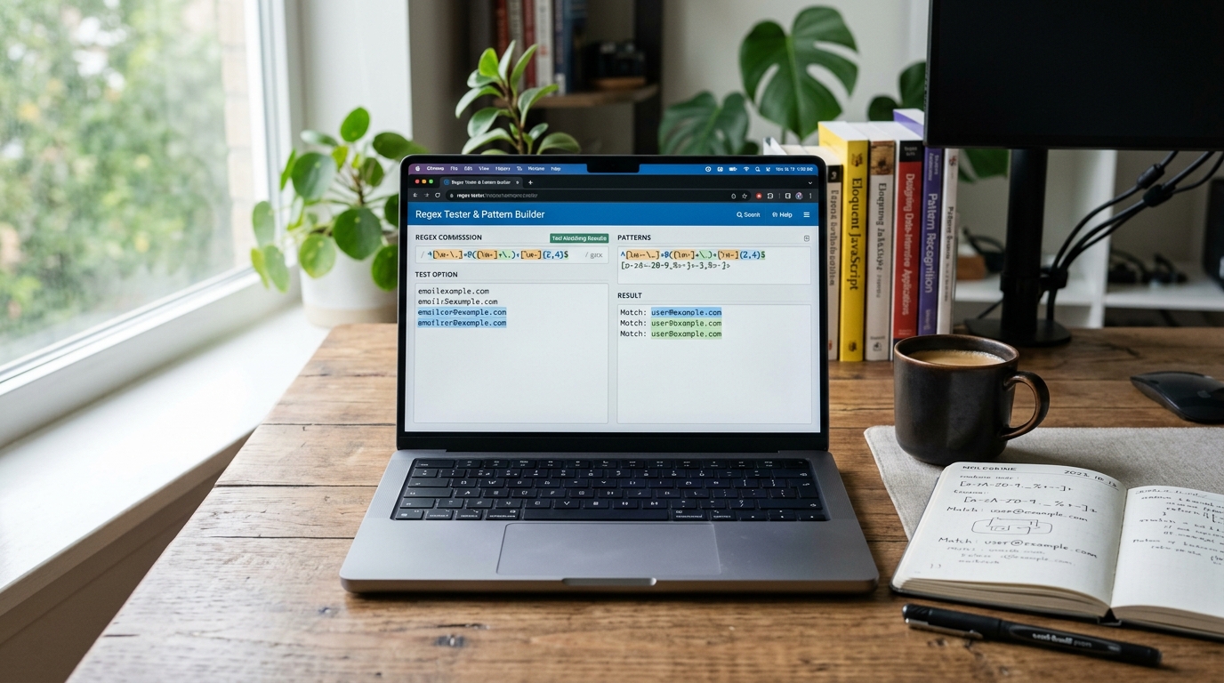
WebAIM Contrast Checker is your baseline. Plug in two colors and get the ratio plus AA/AAA pass/fail. No login. No fluff. Free at webaim.org/resources/contrastchecker/. Has an API for automating checks in CI/CD if you want to catch failures before they ship.
Leonardo (Adobe, free) is the design tool. Instead of picking hex values and hoping they work, you set a target ratio (4.5:1, 3:1, etc.) and Leonardo generates the swatches. This flips the mindset: "make this readable" instead of "make this look like this hex." Built-in CVD simulation for 8 types. Exports to CSS/Tailwind/Figma. If you're building a design system, Leonardo saves you from color-picking in isolation.
Who Can Use does one thing differently. It previews your palette as it appears to users with different vision types, instead of measuring ratios. Plug in your colors, see side-by-side renderings for protanopia, deuteranopia, tritanopia, and monochrome. Free at whocanuse.com. Simpler than Leonardo. You just see if colors are distinguishable.
Coolors generates pleasing color palettes using harmony rules (complementary, analogous, triadic). Useful for getting unstuck when you're staring at a blank canvas. But it doesn't check contrast. Use it for initial ideas, then verify every swatch in WebAIM before you call it done.
Common mistakes to avoid
1. Testing only red-green color blindness. Most palette tools and simulators focus on protanopia and deuteranopia (red-green blindness). Tritanopia (blue-yellow) and achromatopsia (monochrome) are rarer but still real. If your brand uses red and blue, you might fail tritanopia entirely and not notice until you run your palette through Who Can Use.
2. Gray-on-gray "elegance." Slate-400 on white looks sophisticated and professional. It fails WCAG AA (3.1:1 contrast; you need 4.5:1). Your secondary text is now unreadable to anyone with low vision. Elegance is a luxury only high-contrast UIs can afford. Make the hard choice early.
3. Assuming generator output is complete. Coolors will give you six harmonious swatches. Chances are good that not one of them passes 4.5:1 contrast on your actual background colors. Generation and verification are different problems. Good workflow: generate with Coolors for inspiration, verify every single swatch with WebAIM's contrast checker.
4. Color-only status indicators. Red error field, green success field, amber warning. A colorblind user sees three identical fields. WCAG 1.4.1 forbids color as the sole indicator. Pair every color signal with a secondary cue: an icon, a label, a border weight, or a pattern. Two minutes of work. Solves the problem for colorblind and low-vision users alike.
5. Testing only "recommended" color pairs. Your documented palette says "use green-700 on white." A designer uses green-600 on your light-gray modal because they thought it looked better. Never tested that combination. Contrast might be 2:1. Audit every plausible combination in your actual UI, not just the ones in your design guide.
Your practical workflow
Start with Leonardo if you're building a design system. Define your primary brand color. Set explicit target ratios: 4.5:1 for body text, 3:1 for secondary elements and UI components. Let Leonardo generate the shade variations. You'll have a palette that passes WCAG AA before you write CSS. This is the key shift: instead of picking colors and hoping, you design with accessibility constraints upfront.
Verify every combination with WebAIM. Leonardo gives a good starting point, but you still need to test. For each color you'll use, test it on every background where it will appear. White, light gray, dark gray, your brand color. The color contrast checker takes seconds per pair. Sample pixel values from screenshots for real ratios. Five minutes of work eliminates ninety percent of failures that ship.
Preview through different vision types. Run your palette through Who Can Use. Stare at the tritanopia, deuteranopia, and achromatopsia versions. Can you still distinguish status indicators? Can you still read secondary text? If a color disappears in monochrome, adjust it now.
Pair every color signal with something else. Red error fields get a ✗ icon. Green success gets a ✓. Amber warnings get a ⚠. Not because color is bad, but because WCAG 1.4.1 requires it. Colorblind users need more than color to understand your UI.
This workflow takes an afternoon. Shipping an inaccessible palette costs months of repainting when audits fail or customers file complaints.
Bottom line: Color accessibility is a design constraint, not a polish task. Build it in from day one, not as a final compliance check.
Sources
- W3C: SC 1.4.3: Contrast (Minimum)
- W3C: SC 1.4.1: Use of Color
- WebAIM: Contrast and Color Accessibility
- Colour Blind Awareness: Color Blindness Statistics
- WebAIM: Contrast Checker
- Leonardo: Color System Generator